Visualizing Scale in Universal Music Group’s Lobby Headquarters
An innovative live-updating visualization of artists’ streams across thousands of global zip codes, cities, and countries around the world.
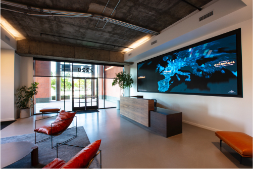
In 2019, Universal Music Group (UMG) began renovating its Santa Monica headquarters and planned to install a 30-foot screen in its main lobby. This became a blank canvas to articulate how UMG has redefined the modern music company for the streaming age, and how it uses real data and actionable insights to empower its artists.
Over the past two decades, while the global music industry suffered from digital disruption and decline, UMG actively led the industry by embracing innovation through new technology and methods of consumption. In doing so, built a robust data and analytics platform, evolving a business that — only 20 years ago — was driven primarily by physical sales.
Watch the Full Visualization
The Brief
Will Tanous, Executive Vice President of Communications at Universal Music Group, tasked our team to use these data sources to create an on-site visualization that would leave visitors with a sense of Universal Music Group’s far-reaching role in the industry, its relationship with technology, and the truly global impact of its artists.
We leaned on our experience with a number of music projects from the past few years, where we’ve developed an understanding for how to bring music and streaming data to life visually.
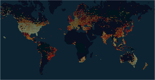
Particularly interesting was the geographic detail of the data Universal Music was processing, sometimes down to the zip code for a particular stream. We saw an opportunity to create an incredibly rich map, visualizing where fans listen to artists.
Approach
With the large lobby screen, which stretched over 30 feet, we had infinite possibilities to design a unique visual experience to accomplish Universal Music’s goals.
As a music company, we also saw an opportunity to wield the lobby’s state-of-the-art speaker system. We loved the idea of the visualization and lobby music working in tandem.
We also set to create a distinct visual experience that could be translated and implemented within other UMG offices around the globe in the future.
Data Sources
We first worked with Universal Music’s data team to identify what we could use to power the visualization. The company’s data team had built a robust data warehouse that could easily be accessed on a daily basis.
Creative Direction
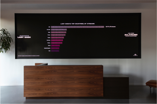
As the lobby speakers could play any song in the UMG catalogue, we decided that the visualization would consist of a 2–4 minute “loop” for an artist. Each loop would visualize the artist’s daily streaming data around the world, synced to a song on their latest album.
Throughout a given day, we could visualize over 150 artists. When choosing what artists to “play,” we created an eclectic mix, representative of the company’s depth of talent, seeding the playlist with a collection of musicians who were most popular globally, regionally popular, or from a unique genre.
Design and Storyboards
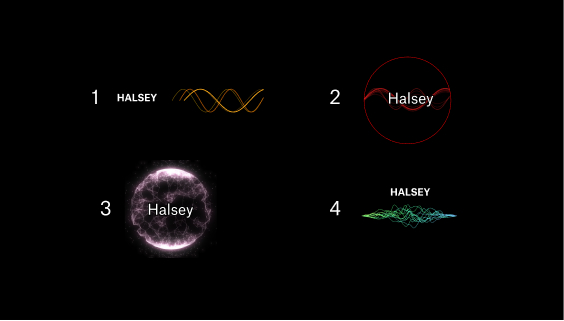
Since we knew music would be synced with the visualization, we explored different aesthetics to show the data.
Idea for “data as particles”
Mood board of other inspiration we found on the web
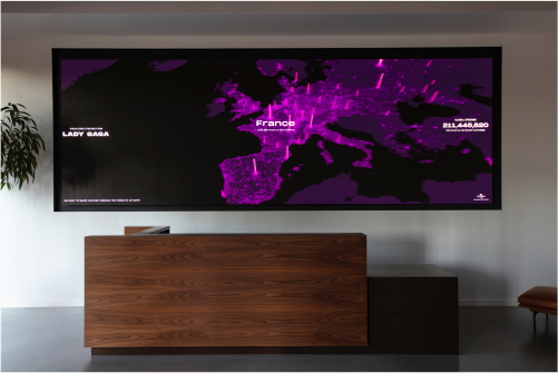
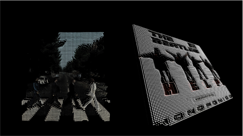
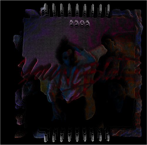
We decided on an aesthetic that would visualize the streaming data as dots that would transform throughout the experience. In the beginning of the visualization, the dots would appear as pixels in the artist’s cover art and slowly represent geographic data on a map.
Cover Art Rendering
Video of data transforming into different “views”
Cover Art Rendering
Cover Art Rendering
We began exploring how these “dots” could playfully transition between different shapes and views of the data.
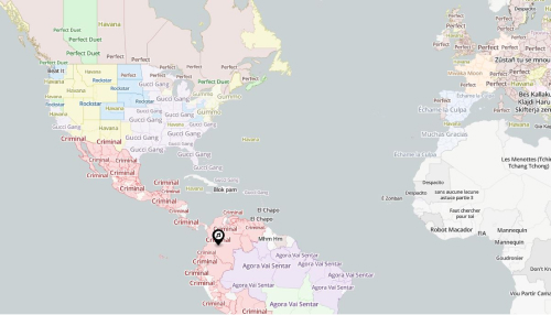
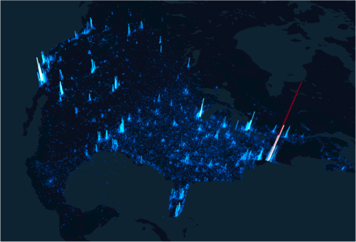
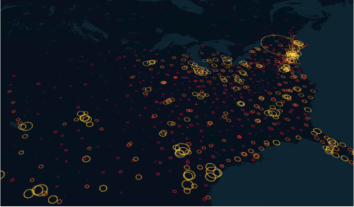
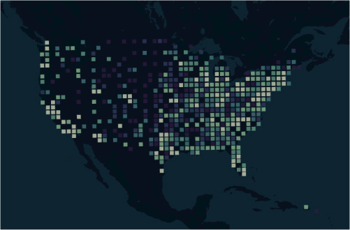
For the maps, we tested a number of design approaches to visualize geographic data. We were focused on finding an expression that most accurately depicted the global reach of the artists, allowing viewers to see the regions driving their popularity.
Popularity of Artist by Zipcode
Popularity of Artist by Zipcode
Popularity of Artist by Zipcode
Popularity of Artist by Zipcode
Popularity of Artist by Zipcode
We mocked up different ways that the data story could flow in each section of the visualization, deciding on an approach that would strike a balance between informational and polished.
Narrative and Timing
The flow of the visualization needed to feel well-paced. We did not want to hold on each screen too long that it would lose interest, but we also knew that viewers would want to understand the data and potentially find insights. We prototyped an experience that included a progress bar, as well as an Instagram-like story UI, with rectangles designating which stage the visualization was in.
We tested several iterations with different cuts and speed, before landing on a flow that lasted approximately 3 minutes.
Timing and Story Flow
Scroll Right to View →
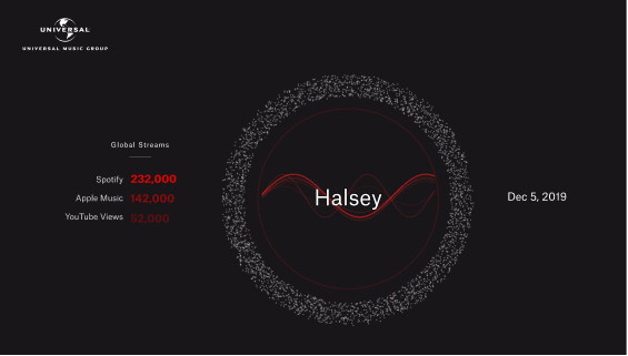
Powering the Visualization with Real Data
We looked to the Universal Music Group Data Team to supply the data sources that would power the visualization. Our first prototype used streaming data from Apple Music, Spotify, and a number of other sources.
For each artist, the visualization would run approximately 3 minutes, so with 100 artists, we’d have about 5 hours of content. The Data Team developed a set of rules that would output 125 artist names, a mix of the label’s top artists globally and top artist’s regionally over the prior two weeks.
Everyday, we would request a new list of artists. The Data Team then developed an API to receive geographic data for each artist, audio for their top tracks, and album cover art.
Data Pipelines
Finally, since the data that’s sent from streaming services is associated with a region (e.g., a city name, zip code, province/state), we mapped each region to a latitude and longitude. That coordinate could then be used for visualization on maps.
Coded Prototypes
With real data, we brought the storyboard to life. Finally, we could see test our assumptions of what the data would “look like” in our visualizations.
We developed the experience using a number of tools (three.js for the globe visualizations, Mapbox and deck.gl for the map visualizations).
On-site Adjustments
During installation, we tweaked the visualization to account for sunlight glare, legibility, and field of vision.
Final Release and Roll-out
The visualization is live in three areas of Universal Music Group’s Santa Monica office, updating with new data each day.
Over 2020, the visualization will be launched in other UMG offices, including New York City, Sydney, and London.