


Reconstructing seven days of protests
Our process for a collaboration between The Washington Post and Google News Initiative.
This data visualization project aims to provide a more complete view of the May 2020 protests in Minneapolis following the police killing of George Floyd, one that might give more context than the widely-circulated clips on social media. Over the course of 8 weeks, we worked alongside the Washington Post’s Lede Lab , an experimental news team dedicated to exploring emerging technologies, to pitch a story, identify and clean data, interview experts and live streamers, prototype a design, and ultimately produce a visually-led story .
Flowing Data, which selected this project as one of its Best of 2020 , described the story succinctly:
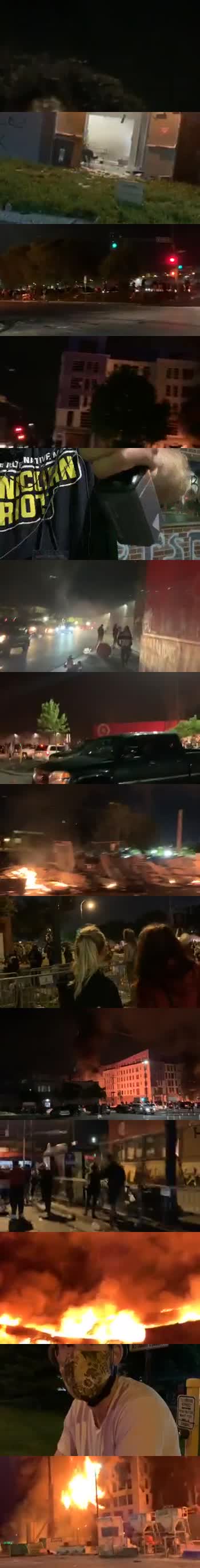
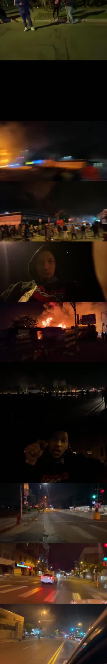
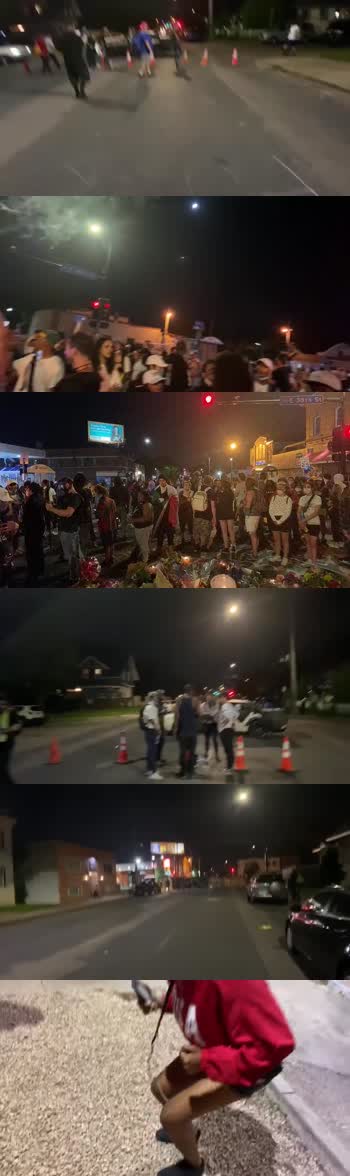
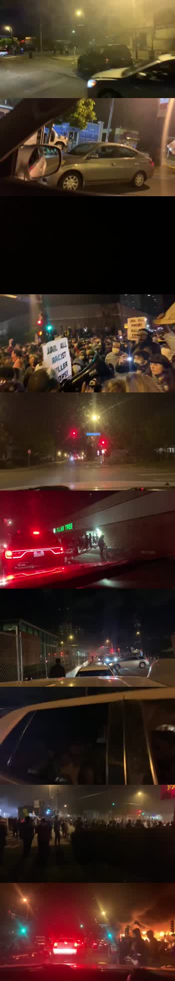
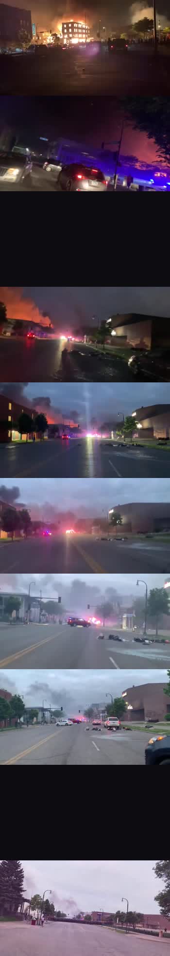
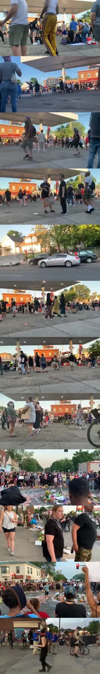
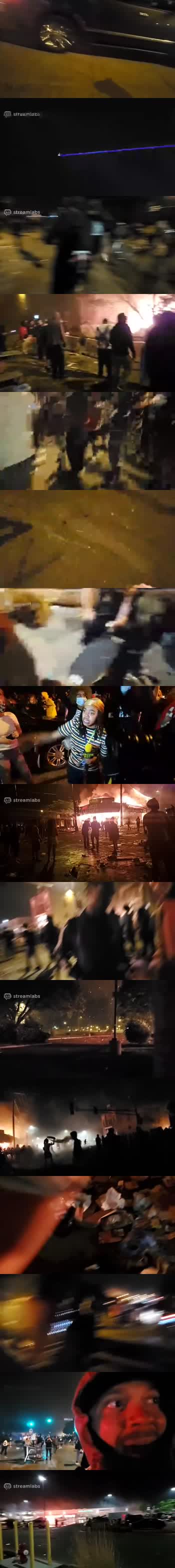
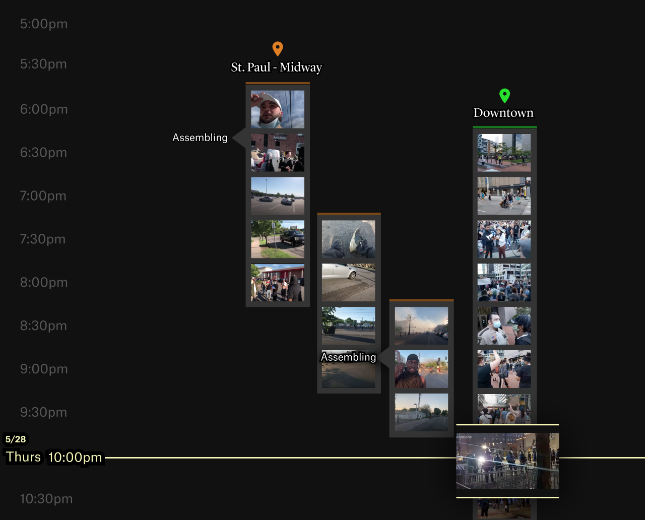
From a distance, it’s difficult to build an understanding of the scale and nature of protests. A soundbite here. A video clip there. So, to show the Minneapolis protests more completely, The Washington Post and The Pudding stitched together 149 livestreams with timestamps and location.
With so much footage, it’s easy to imagine any sense of narrative getting lost in a bunch of moving pictures. But the layout and structure of this story, organized as a timeline and categorized by area, really help you see what happened over a week.
Step I
The Challenge
The project began when The Washington Post came to us with the idea of wielding the recent deluge of protest live streams in the aftermath of Floyd’s killing. Supported by the Google News Initiative, our team at Polygraph worked alongside the Washington Post to build a visualization that explored the complete anatomy of the protest, improved discourse around the events, and broadened global understanding.
Step II
Strategy
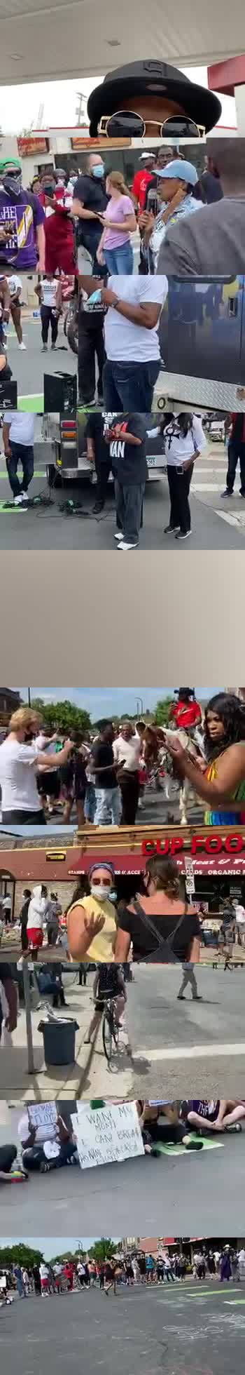
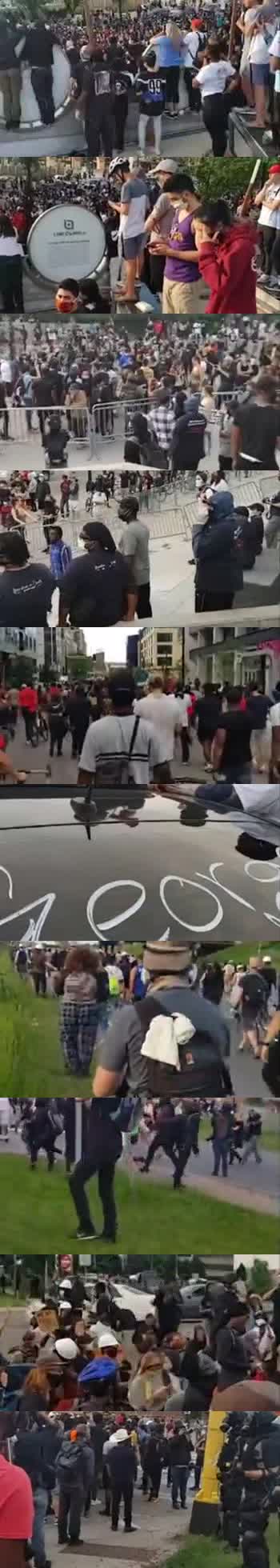
Through several rounds of proposals and brainstorms with the client, we developed a vision for the project: it would focus on Minneapolis and the first week of protests following Floyd's death. Using livestreams uploaded to YouTube, Facebook, and Instagram, we collected timestamps and locations to recreate the events that were streamed to millions of people. By wielding code, animation, and embedded videos, we created a visual experience for readers that would add more context to how the events unfolded in Minneapolis, as well as elevate the footage of peaceful marches that may have been less emphasized in both traditional and social media.
Step III
Discovery
Our team was tasked with identifying salient live streamers in Minneapolis. Over weeks of research, we identified 25 live streamers who had participated in multiple days of protests and broadcasted several hours of footage per day.
Step IV
Data & Insights
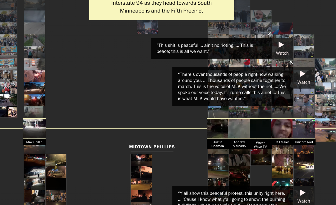
With support from the Washington Post, our team reviewed live stream footage and social media metadata to align hundreds of videos on a common timeline.
During the strategy phase, we had several ideas that we imagined could lead to compelling visual narratives (e.g., surfacing protest chants, protest signs, or marching locations). We began by combing through several hundred hours of footage to organize videos by their location and content. This gave us a better idea of whether our narrative hunches were accurate and helped us identify the most interesting content that we should surface to readers.
Step V
Design Approaches
Our team began by mocking up different ways in which the data could be viewed by readers.
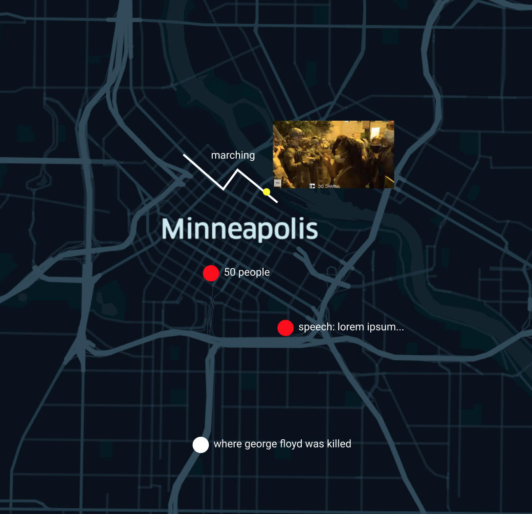
Map View
One story angle focused on a map as the primary interface for exploring protest live streams. Each video would be a line, spatially mapped to its geographic coordinates.
Here, we imagined that 4 to 5 live stream videos could also be thumbnails on the map.
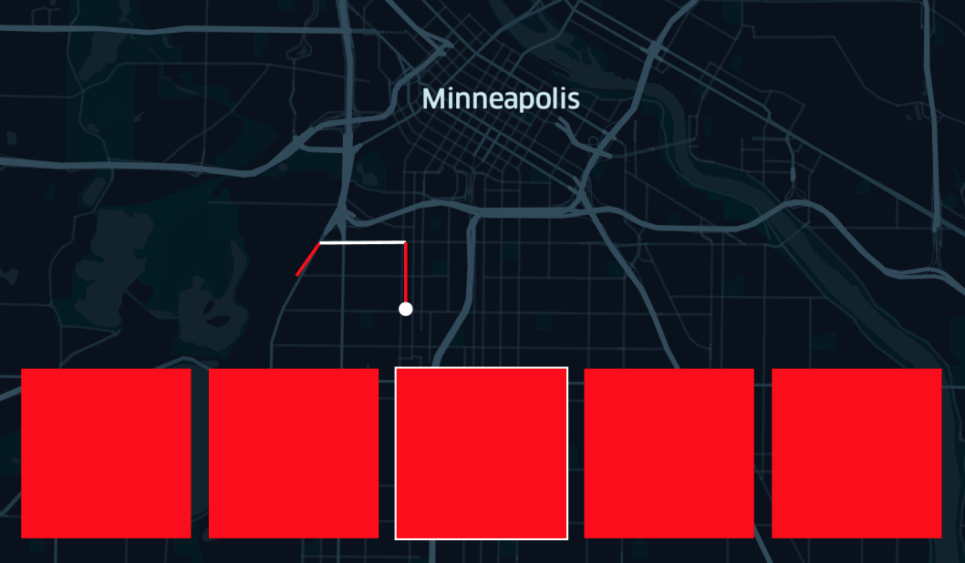
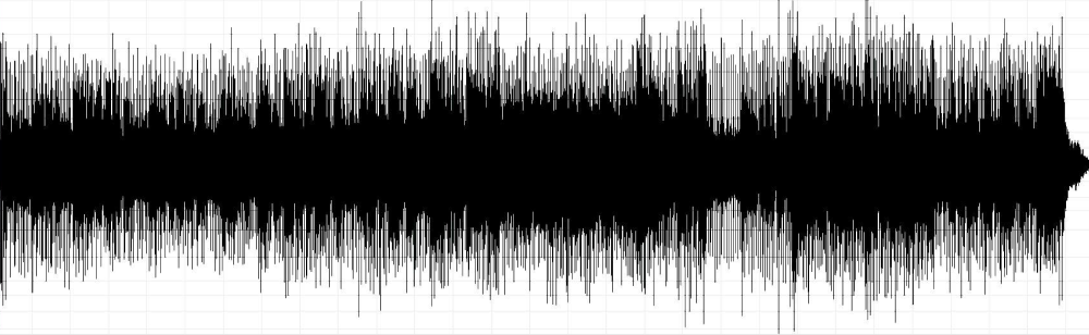
Audio View
Each video was also characterized by highly distinct audio, whether there was a large crowd, a single speech, or chanting. We considered using the waveforms of the audio in the interface.
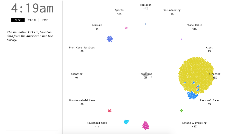
Moving dots
Nathan Yau’s A Day in the Life of Americans came to mind as an inspiration for the interface, which used a network graph and moving bubbles to show both time and activity.
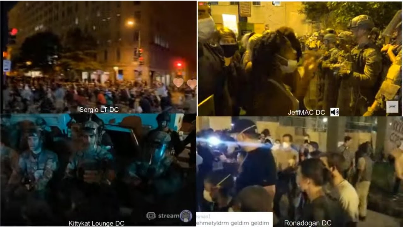
Video Mosaics
We considered a video mosaic that would grow and shrink as more videos were added, in the event that we decided to sync up all the footage across multiple streams.
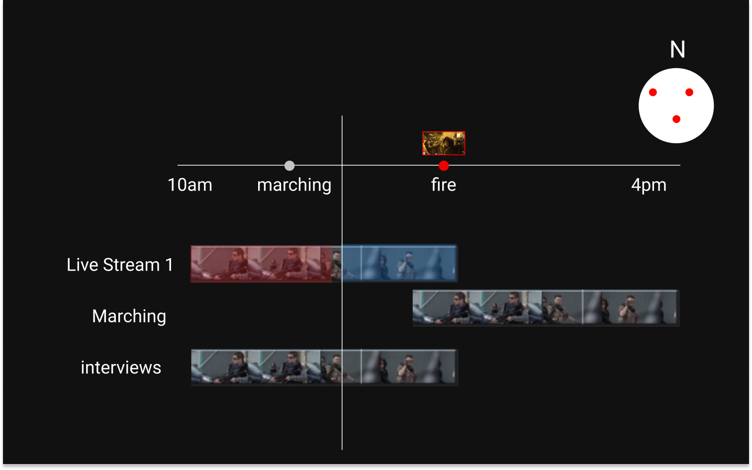
Video Timelines
We were intrigued by how video editing software organizes video clips. We liked the idea of a timeline with each row representing a video, and frames of the video used as a thumbnail.
Timeline Abstractions
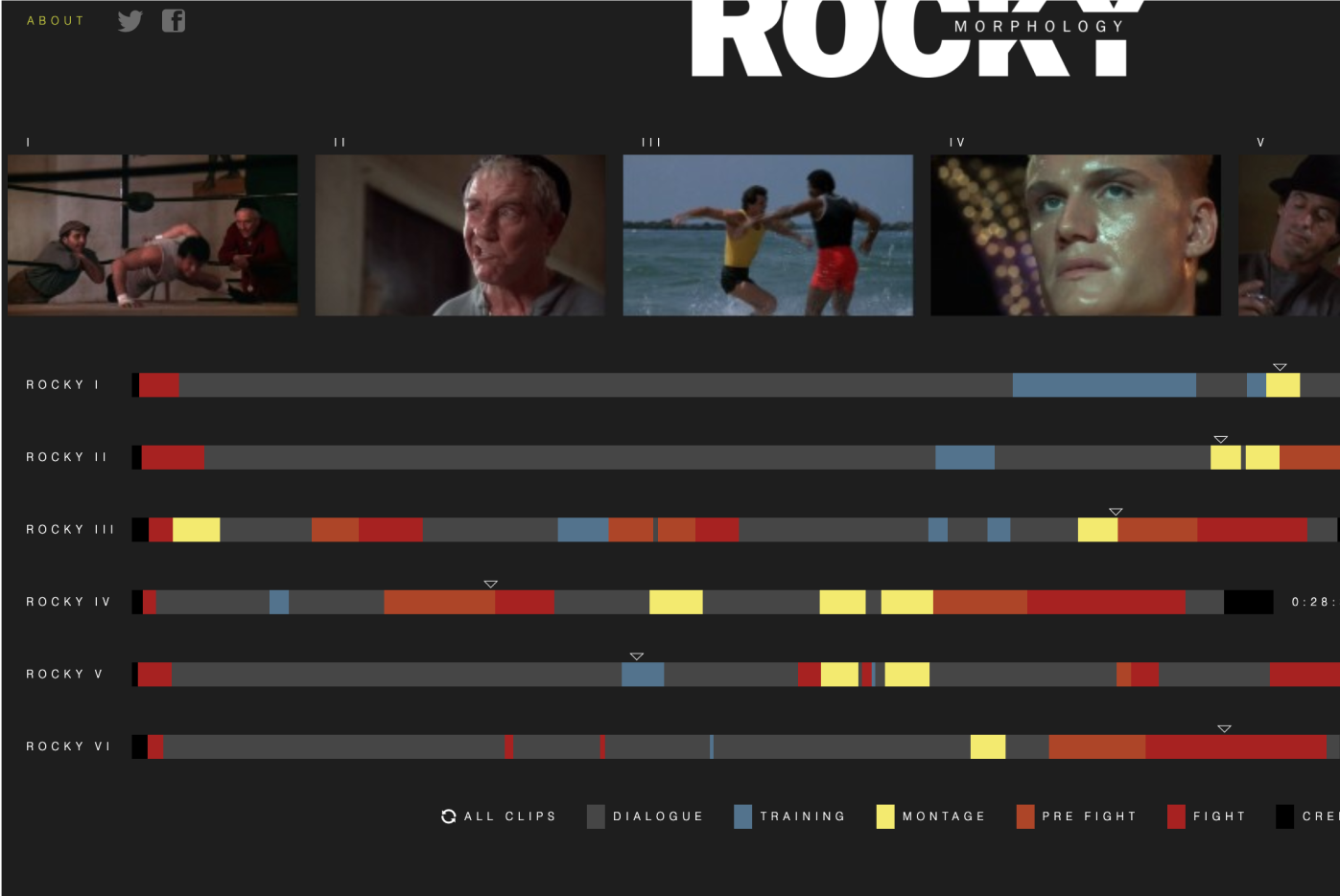
There were two projects that served as inspiration for the interface. The first was Fathom’s formative Rocky Morphology , where each movie is stretched across a horizontal timeline, with scenes color-coded by topic. Readers can mouse-over the timeline and see thumbnails of the movie—an easy way to visually preview the color-coded content of the timeline.
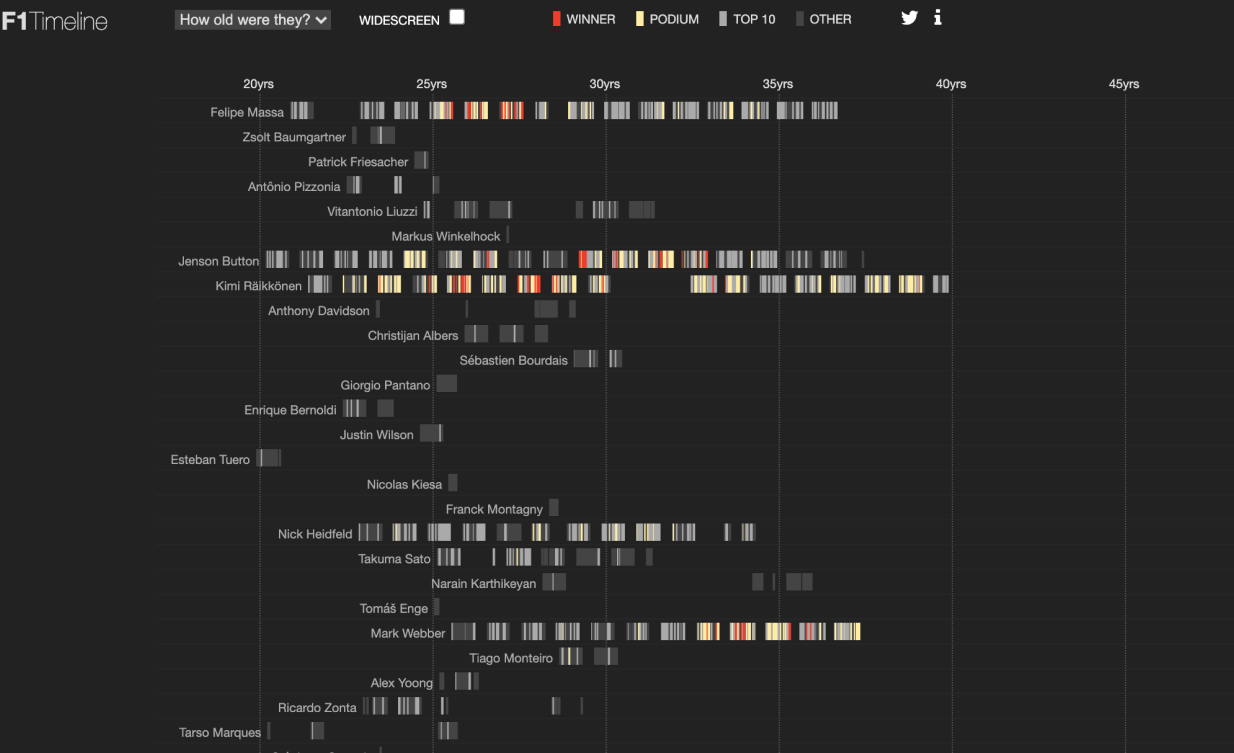
The second was Peter Cook’s F1 Timeline , which uses a similar color-coding approach on a timeline, where readers can easily see the ranking of races.
These two projects, coupled with our initial leanings, convinced us to embrace a timeline approach.
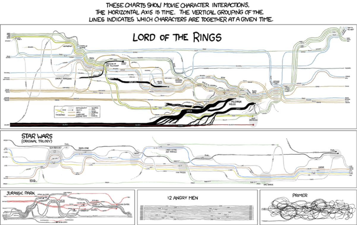
Washington Post's lead creative technologist brought up the idea of clustering the video clips on a timeline, much like the narrative timelines approach of this iconic xkcd comic . Next, we realized that we could turn the timeline 90 degrees. That way, the interface of the timeline could be stretched across the length of the webpage, and readers could zoom to different parts by just scrolling.
Second, the team had a breakthrough when someone mentioned turning the timeline 90 degrees. That way, the interface of the timeline could be stretched across the length of the webpage, and readers could zoom to different parts by just scrolling.
We decided this would be the best approach: group the videos on a vertical timeline.
The next phase of the project involved thinking about how to best pull off this design. A few challenges we encountered were:
- How could the content of the videos be presented so that readers explored at least a few clips, but were not overwhelmed?
- What was the minimum valuable experience a reader should have? Did they have to interact with anything?
- How do we create a valuable experience if a reader only has 5 minutes? Could the experience improve even more if they spent 30 minutes with the project?
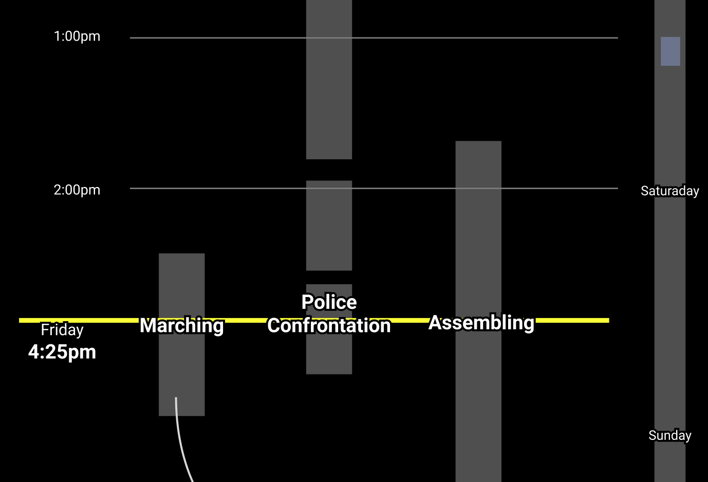
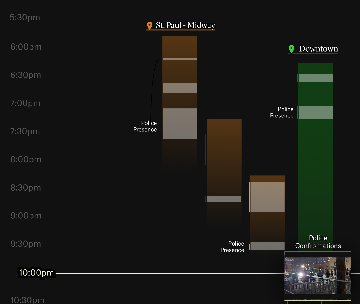
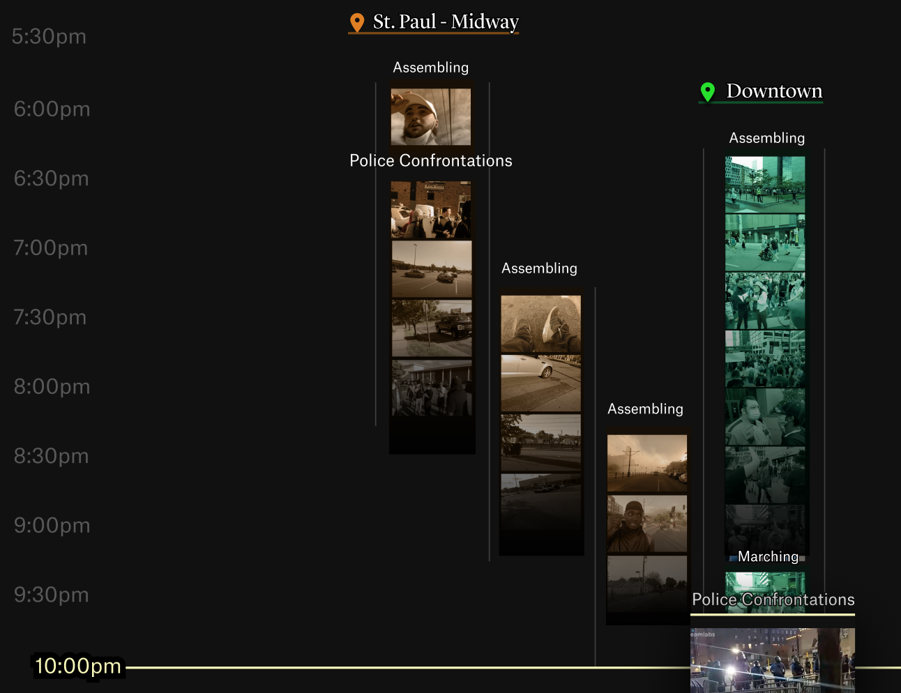
- What should readers see in the timeline? We considered audio data (e.g., chants), video content (e.g., signs), what was happening, and the video’s location.
- How do we thoughtfully use color to encode metadata about the videos?
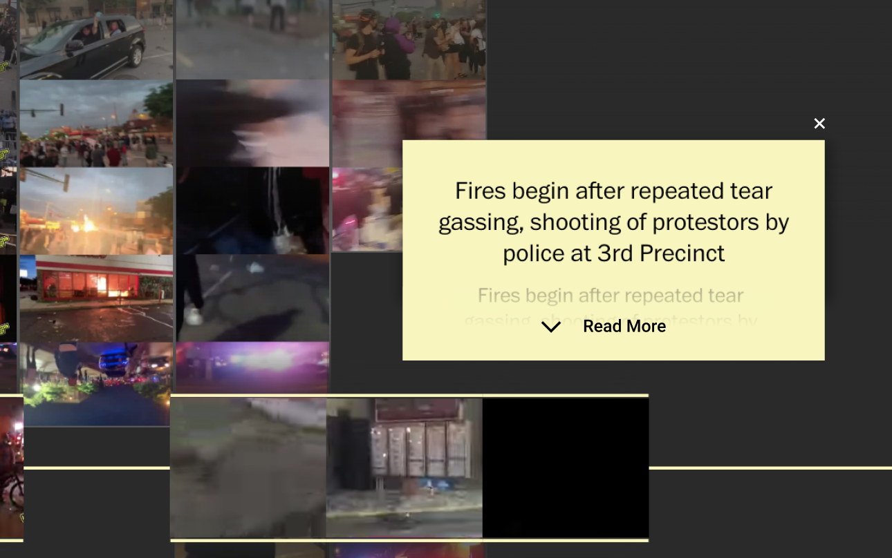
- What should the annotation layer look like? Where is a reader’s attention drawn at specific moments of the timeline?
- How do readers access the full videos when they want to watch a clip?
- How should we use thumbnails and static frames (or even gifs!) of the original livestream videos?
This involved a few weeks of iterating on designs, coding up prototypes, and seeing how they felt in action.
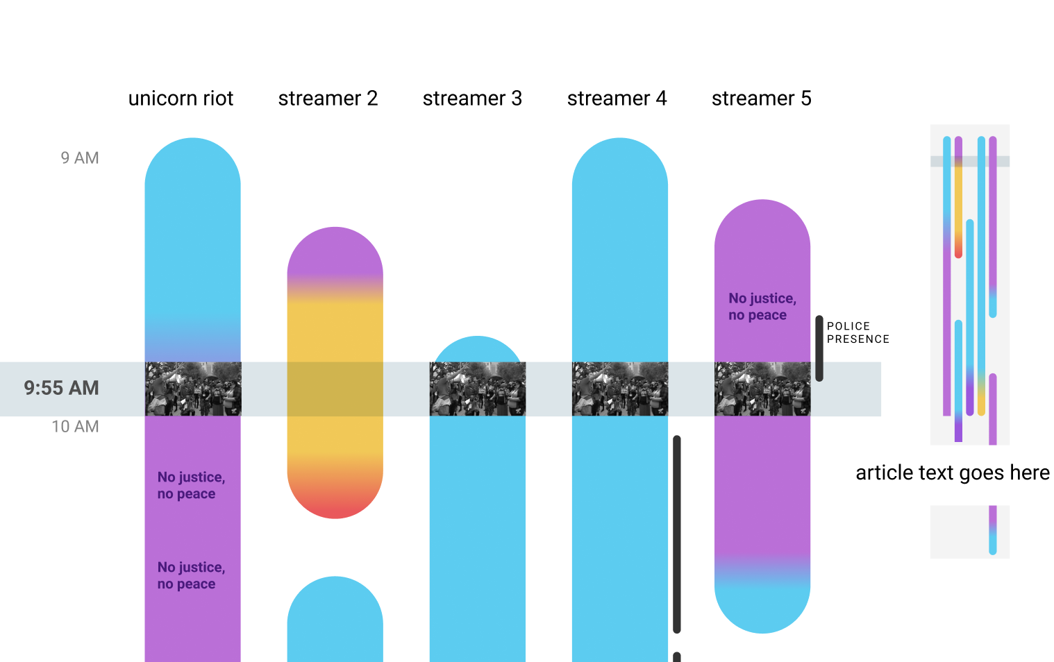
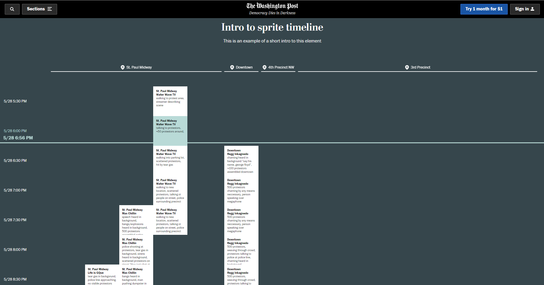
Eventually we landed on a simple design approach that would keep each clip on one vertical line.
We also began to explore the use of thumbnails and color to make the timelines easier to read.
After we had a clear sense of the default interface, we designed the annotations, so that readers could quickly grasp what was important to know and interact with.
Step VI
Tech details
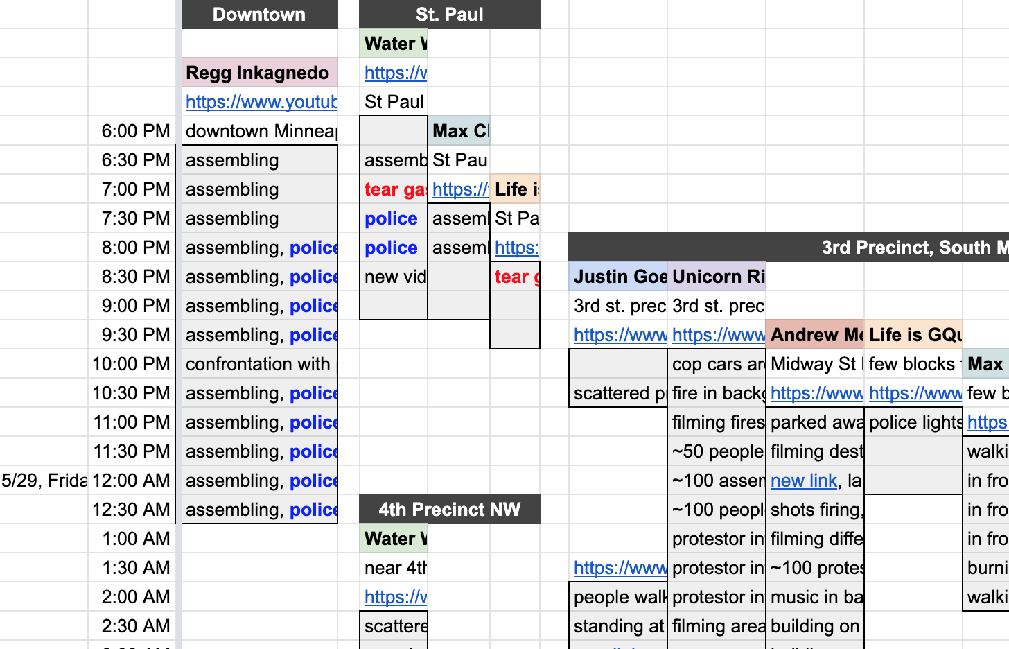
In order to process the 149 streams, we created a spreadsheet of each video and its starting time.
Processing the videos
We wrote a node.js script to fetch each video from Facebook or Youtube and process them locally.
Once we had every video, we wrote another script that ran through every video and used ffmpeg to:
- Grab screenshots every 10 minutes
- Grab an 8-second movie every 10 minutes
- Stitch both images and movies into one image, with each clip stacked vertically
These scripts were straightforward, but handling videos was time-consuming! Sometimes we would need to run the scripts overnight, to handle all of the content.
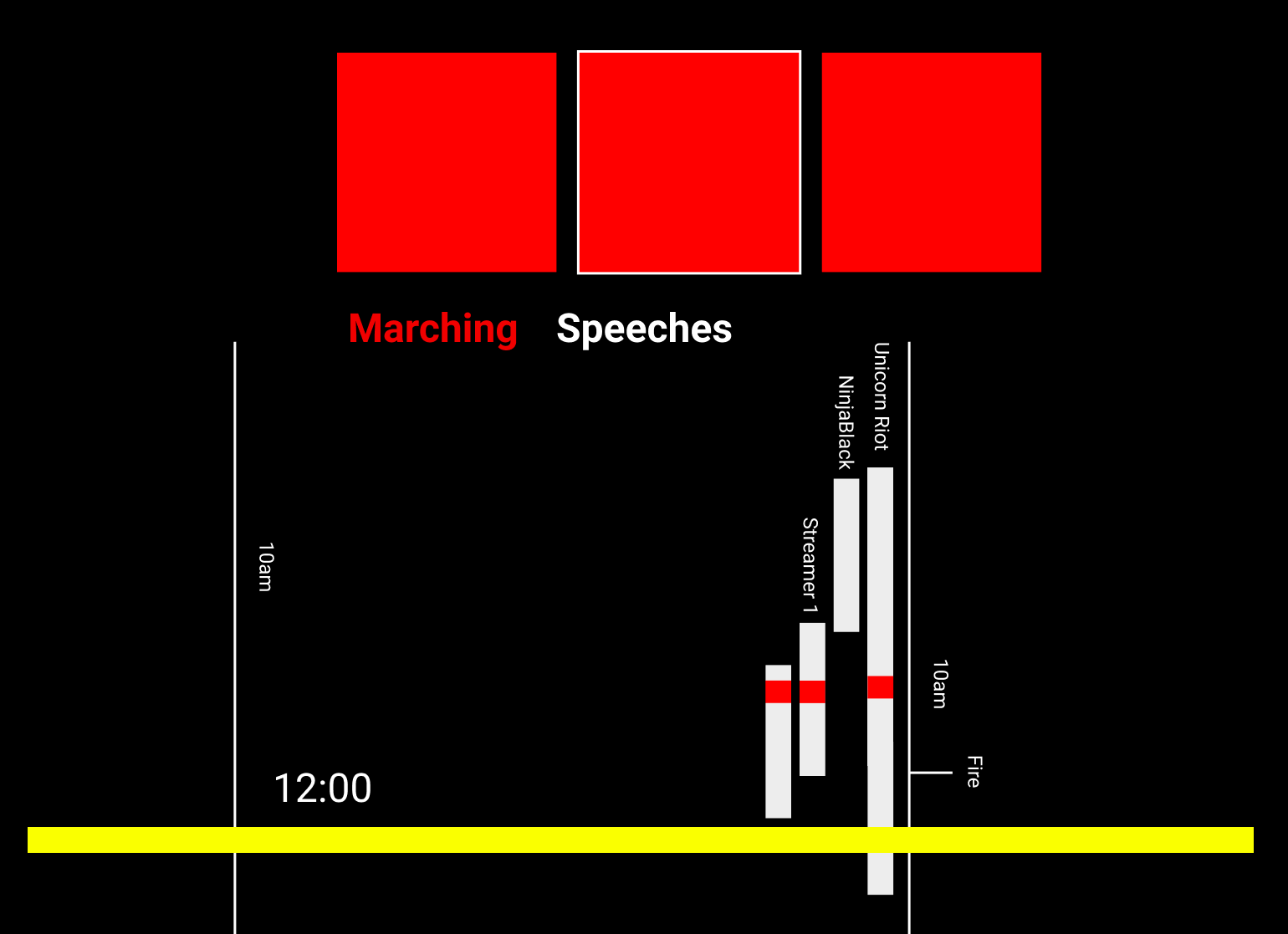
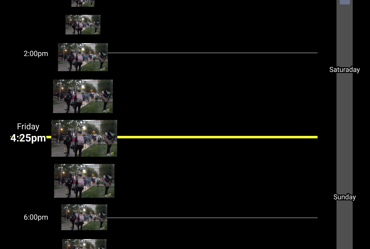
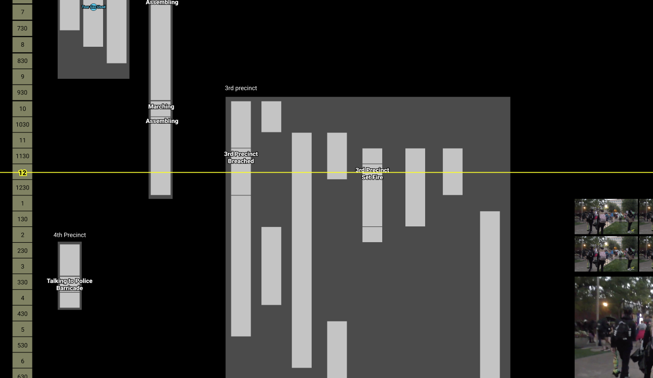
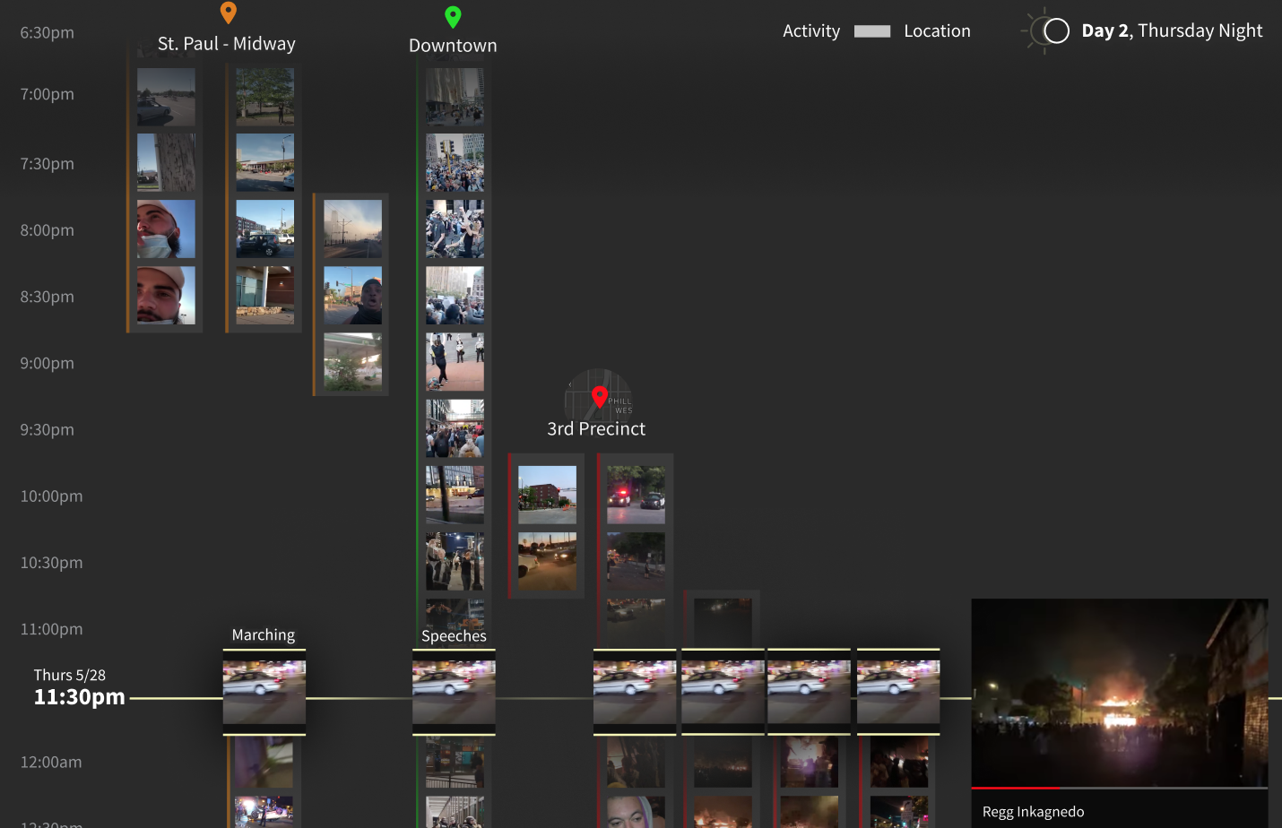
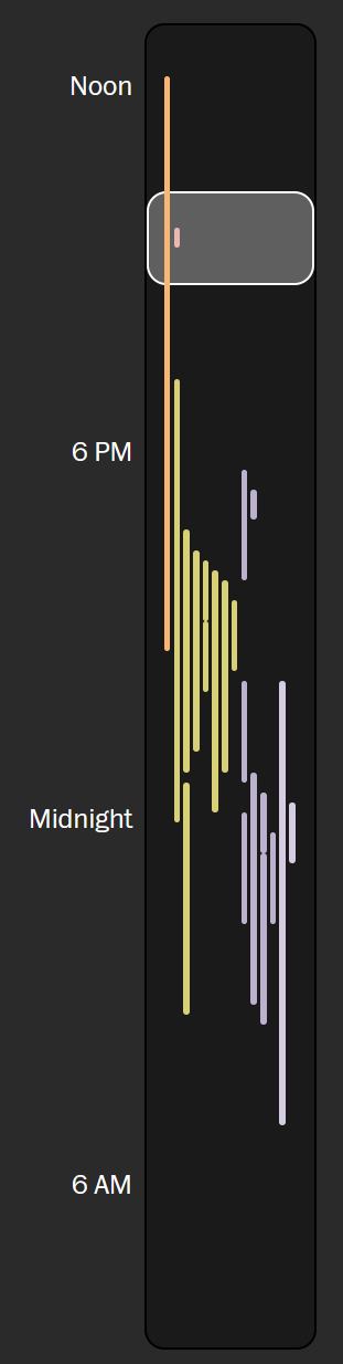
Drawing the minimap
The days of protests were long and filled with many streams. We wanted a way for readers to quickly see the shape of the day at a glance - when and where streams were happening.
We added a sticky minimap to the right-hand side of the site that oriented readers on the timeline as they scrolled. We added a white box that showed the currently visible portion of the timeline to provide more context.
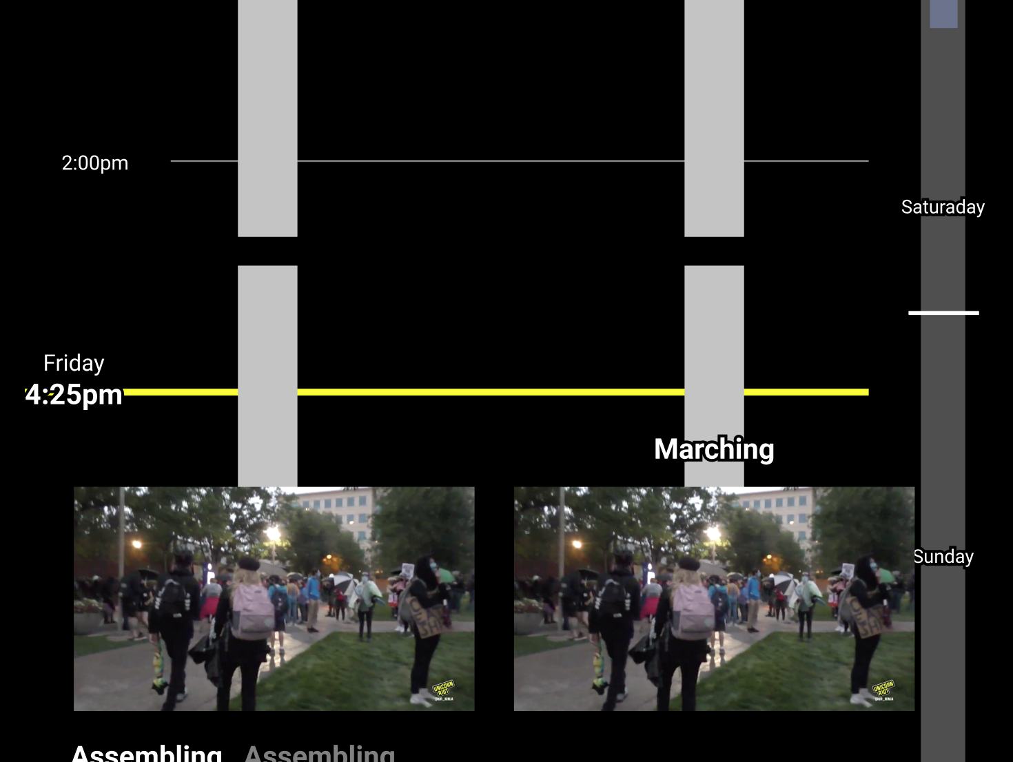
Highlighting the current time
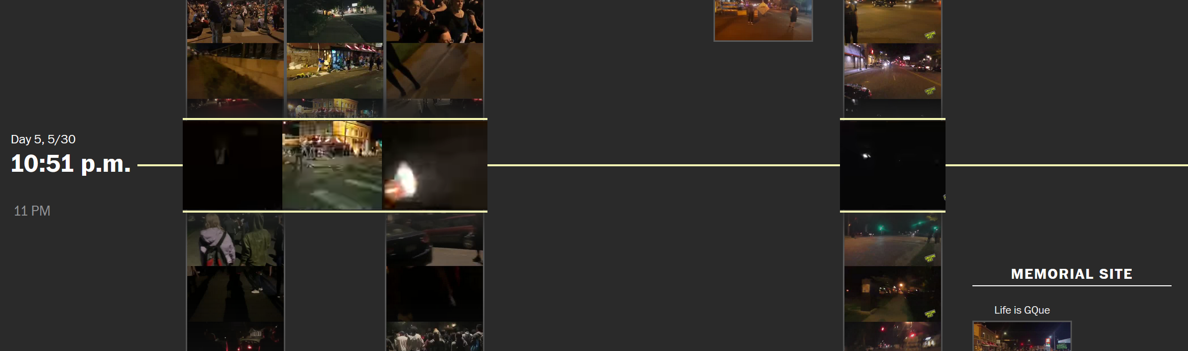
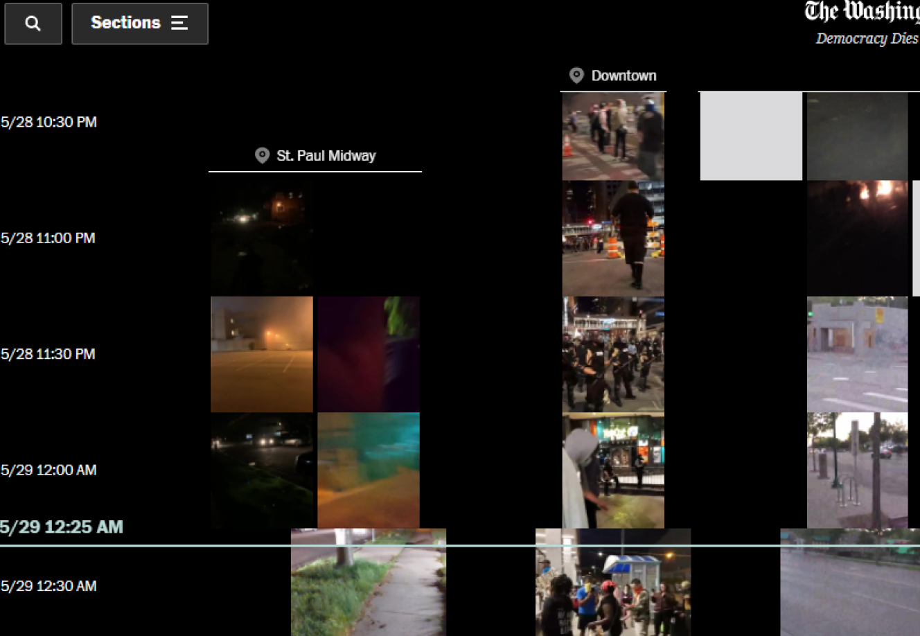
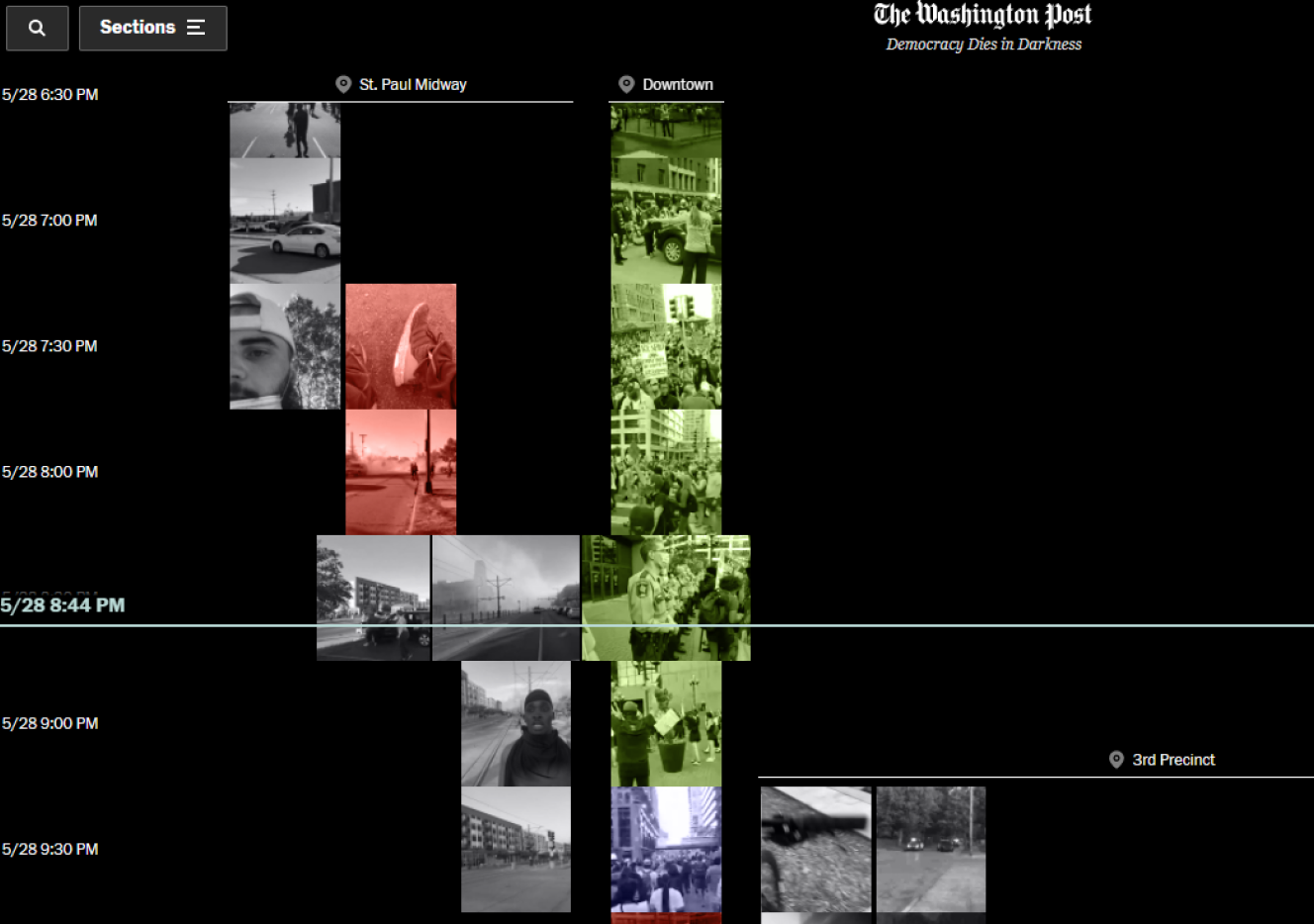
We wanted the images to "play" when they reached the middle of the screen, intersected by the yellow bar. This reinforced where the reader was in the overall timeline as they scrolled down the page, and allowed us to scale up the currently-playing clips, for easier viewing.
As the reader scrolled down the page, we checked how far down the timeline they had progressed, converting that percentage into a timestamp. We then found any video clips that covered that time, and stored their id and x-position. We played active clips in the vertical center of the page, highlighting the current date and time with a yellow bar that spanned the full width of the page.
Presenting the inline videos
There were 1,841 video clips — one for every ten minutes in a stream. We weren't about to make readers load that many videos!
Instead, we created spritemaps for each video, then cropped and positioned them to only show the active clip. The toughest part was handling the math, with dynamically-sized strips.
Positioning the streams
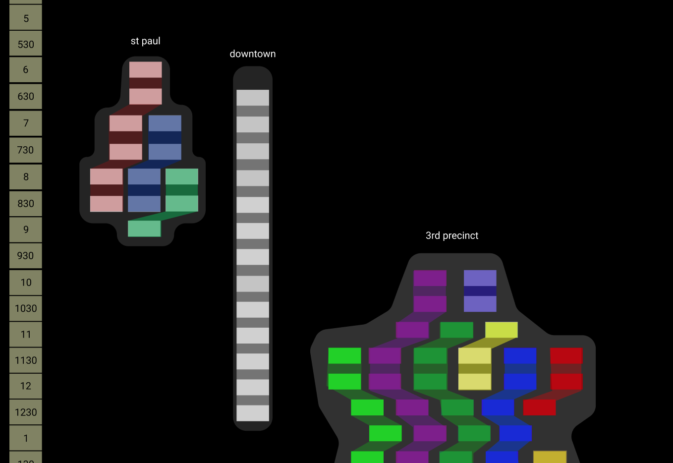
Once we had our stacked clip images and our design in place, we needed to programatically plan the placement of each one, while meeting the following requirements:
- Round the actual start & end times for each clip to 10-minute intervals, so they would line up on our grid
- Group them by location
- Keep the same streamer within the one column, even if they took a break from filming
- Have as few columns as possible, to fit everything on the screen while maximizing image width
- Size the streams responsively, to fit on any window size
Whew, that's a lot of requirements! We ended up with a long node script that spit out a JSON file, which we then ingested into our rendering code. Each video was positioned absolutely according to the percent of the window's width. This way, the images scaled smoothly when a reader resized their window.
Making things performant
Keeping the site snappy was a really big focus for us! Sending 1,841 images and videos over the wire, and rendering them all, is not an easy feat. We spent a lot of time compressing media files (yielding smaller files), stacking them into spritemaps (allowing for fewer files), and lazy loading them appropriately.
Working within existing systems
We are able to pick up and work with whatever system is best for the project — we jumped right into the Washington Post's great internal tools.