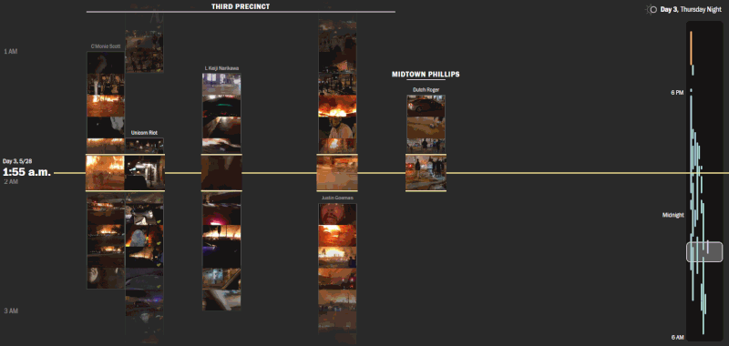
The Washington Post
Reconstructing
seven days
of protests
In May 2020, a recording of George Floyd's death sparked a week-long protest in Minneapolis, escalating into a summer of historic protests across the whole country. Polygraph partnered with Google and The Washington Post to produce a project visualizing these protests.
Google News Initiative
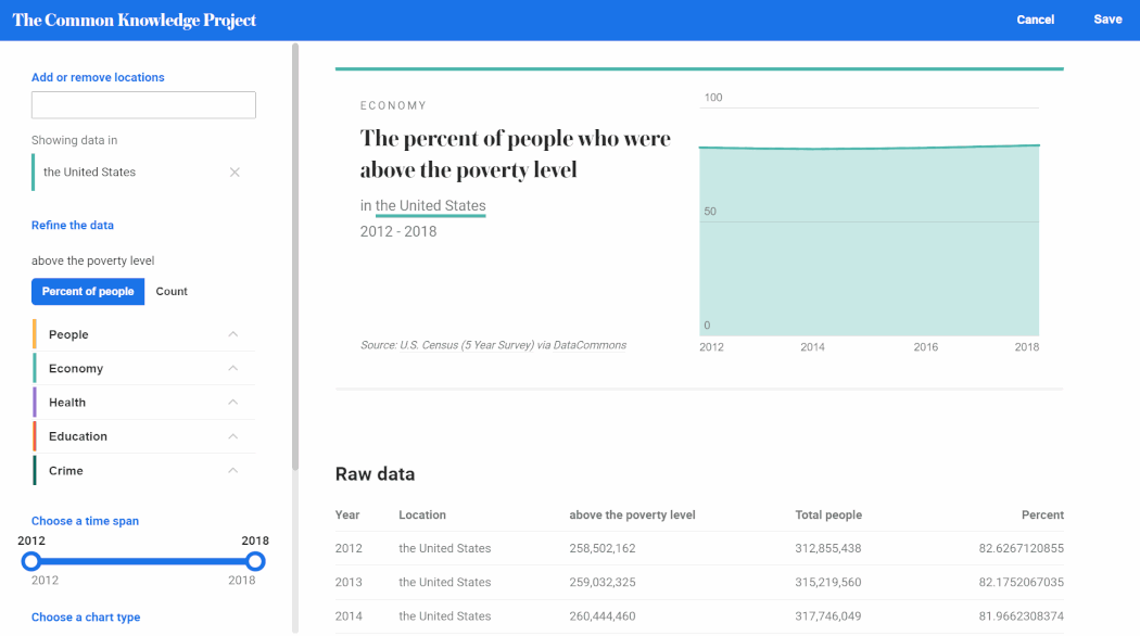
Common
Knowledge
The goal of the Common Knowledge Project is to make it easier to explore, visualize, and share data about important issues in your local community. We built this first beta version with local journalists in mind, to help them make sense of public data and include it in their reporting.
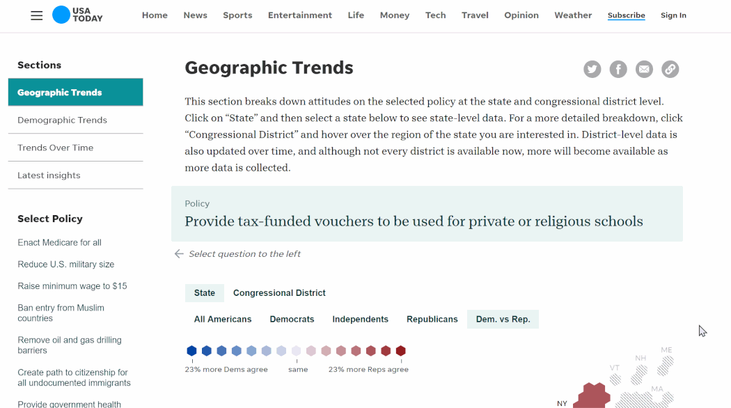
USA Today
Nationscape
Insights
The Democracy Fund + UCLA Nationscape Project have been surveying voters on their positions on important policies since summer 2019. We created a dashboard to surface insights as the results continue to be updated.
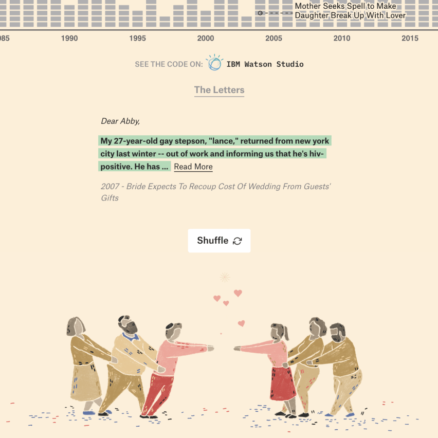
IBM Watson
30 Years
of American
Anxieties
In partnership with IBM Watson, we looked at over 20,000 “Dear Abby” advice column letters to find what Americans worried about over the last 30 years. The project utilized IBM Watson APIs to measure sentiment.
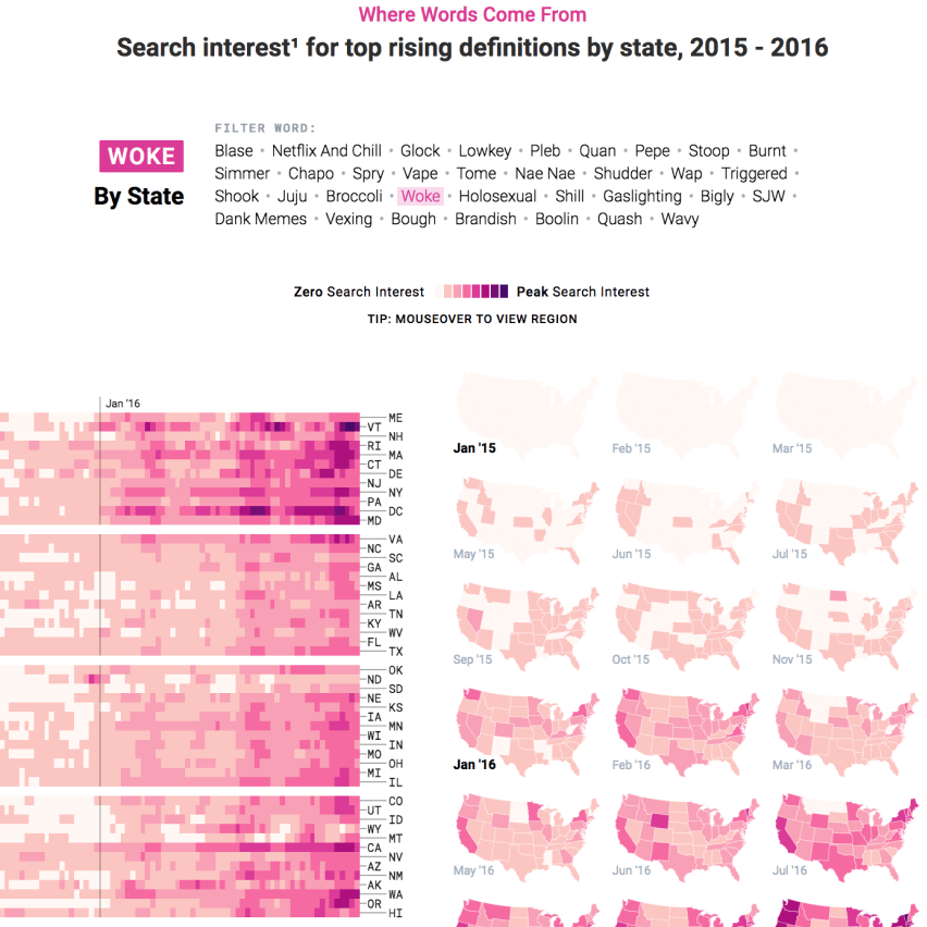
Google News Lab
The Year
in Language
We identified 2018’s rising words by ranking Search interest growth for definitions of words (e.g., searches for “woke definition,” “define woke”). The project was the subject of an NBC video series.
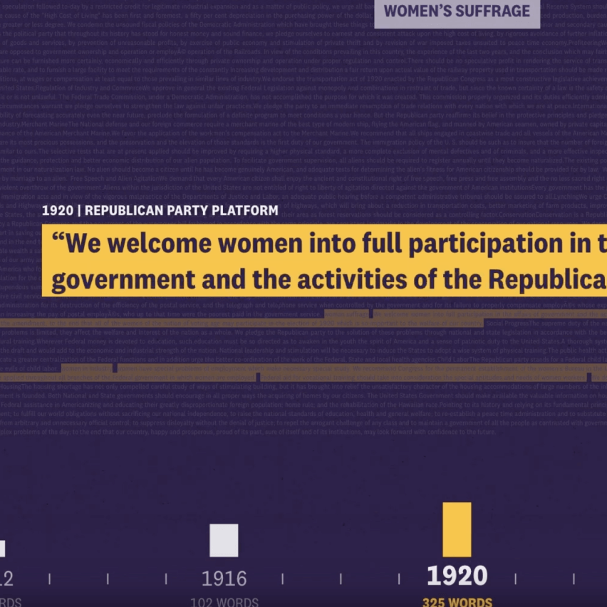
Smithsonian National Portrait Gallery
Votes for
Women: A
Portrait of
Persistence
In partnership with the Smithsonian National Portrait Gallery, we analyzed political party platforms to find how often women’s issues appear in the text. We produced a data-driven video that you can see live at the gallery in Washington DC until January 2020.
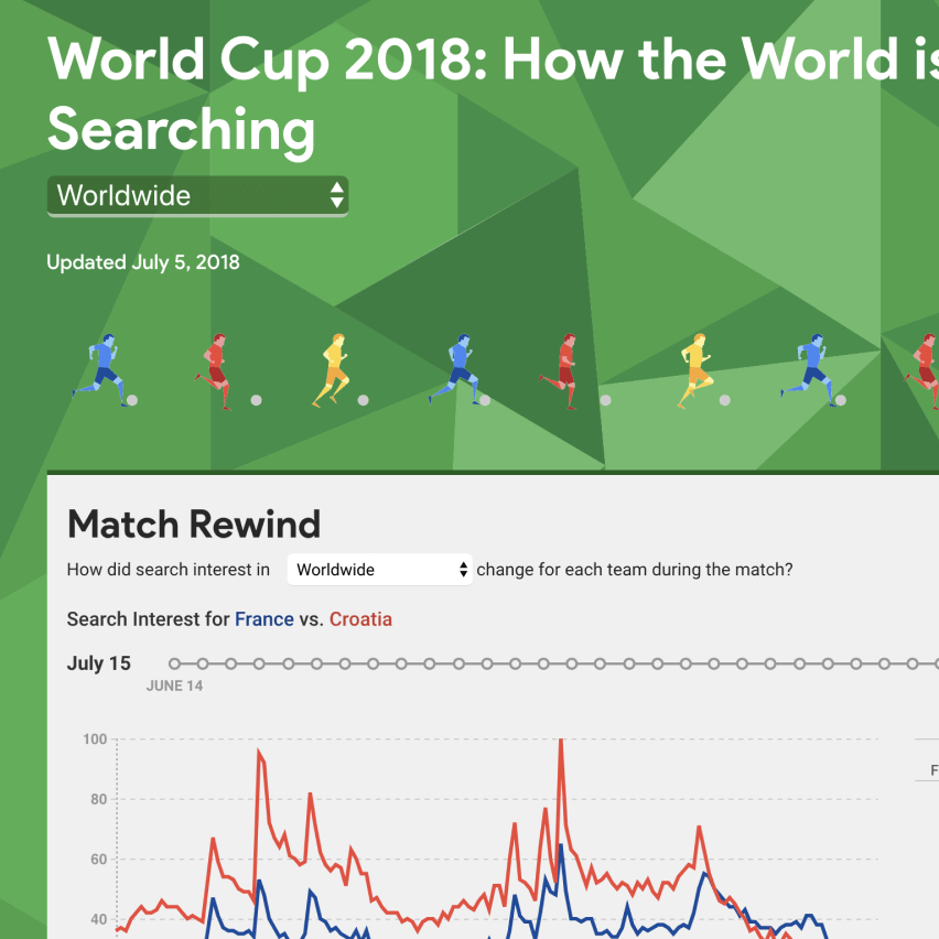
Google Trends
World Cup
2018: How
the World
is Searching
We created a live-updating data hub for all things World Cup and Google search data. The site includes data for over 20 countries and translated in 5 languages. The project was covered in several media outlets around the world as an input for local World Cup coverage.
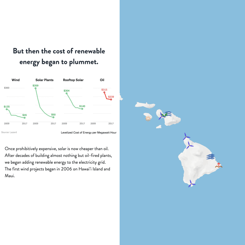
Elemental Excelerator x Emerson Collective
Transcending
Oil
In tandem with Rhodium Group, a research firm, to bring to life a report on how Hawaiʻi can achieve 100% renewable energy, communicating the study’s main findings to a general audience.
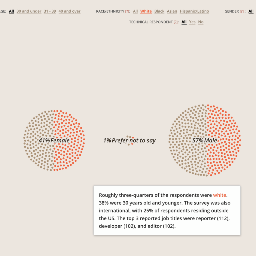
OpenNews
News Nerd
Survey
We visualized survey results from 800 people at the intersection of journalism and technology to understand who they are, how they learn and support one another, and where they go next.
Viacom
Fan Theory
This three-part essay was executed using partner data from IMDb, including a neurological, fMRI study of South Park. It will also featured as a panel at SXSW 2018.
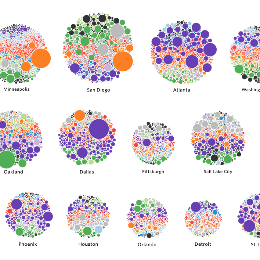
Kickstarter
Creative
Communities,
by City
Anecdotally, aspiring musicians flock to Nashville. Portland has a vibrant food truck scene. Theater is rooted in New York City. Yet what about other cities? What is the creative fabric of Cleveland? Where do comic book writers cluster?
We worked directly with Kickstarter (and used a data dump of thousands of projects) to get answers.
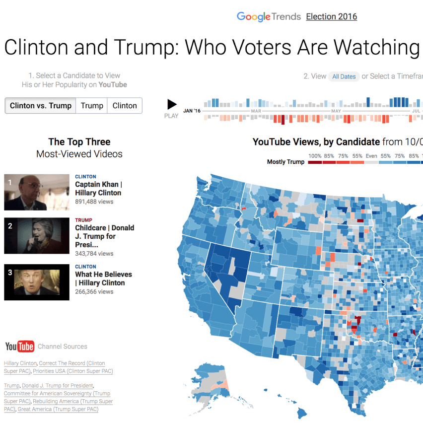
Youtube
Clinton and
Trump: Who
Voters Are
Watching
Before the 2016 US Presidential Election, we examined behavior of YouTube viewers. The project received press from the Washington Post and Daily Mail.
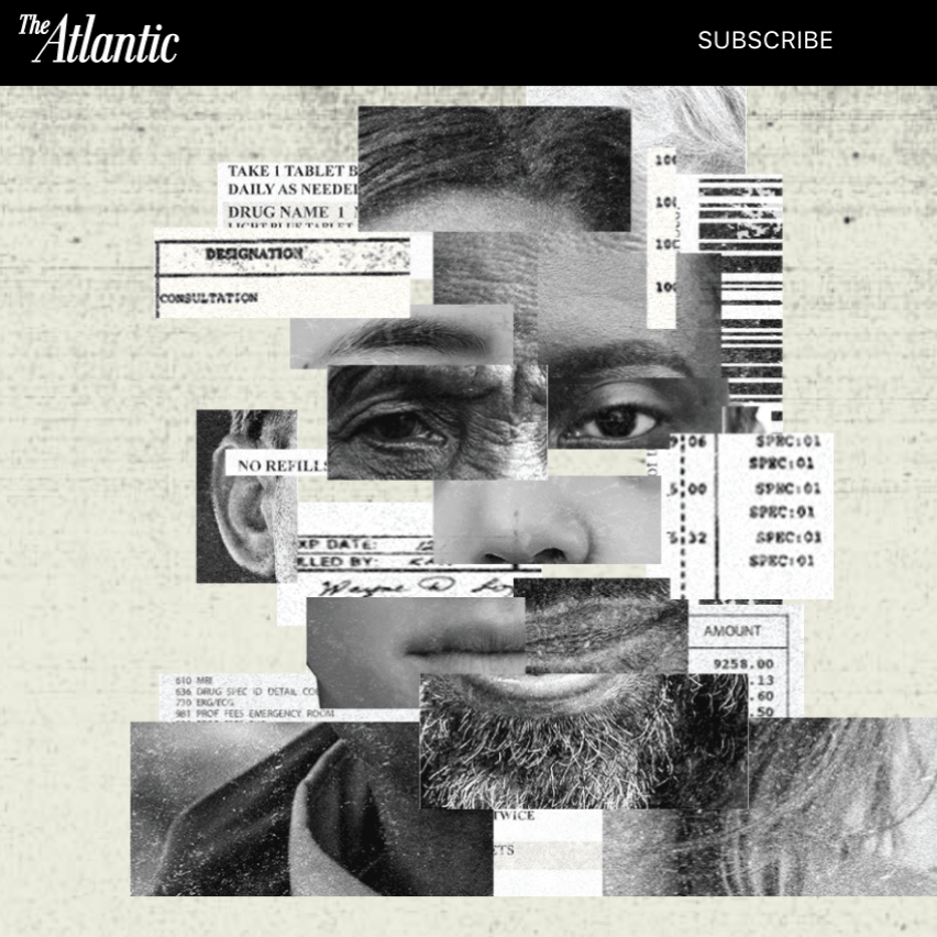
The Atlantic
The Platinum
Patients
After reaching out for visualization support, this collaboration with The Atlantic investigated health care: each year, 1 in every 20 Americans racks up just as much in medical bills as another 19 combined. This critical five percent of the U.S. population is key to solving the nation's health care spending crisis. linkText: Visit the project
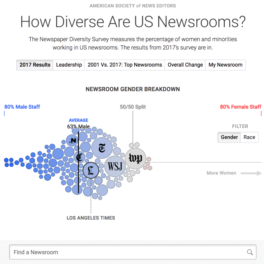
American Society Of News Editors + Google
How Diverse
Are US
Newsrooms?
Using exclusive data from the American Society of News Editors, we visualized 15 years of gender/diversity data from hundreds of newsrooms.